Gabbiano’s
Completed:
2022
Roles:
︎ Brand Strategy
︎ Identity Design
︎ Collateral & Signage
︎ Interiors
Collaborators:
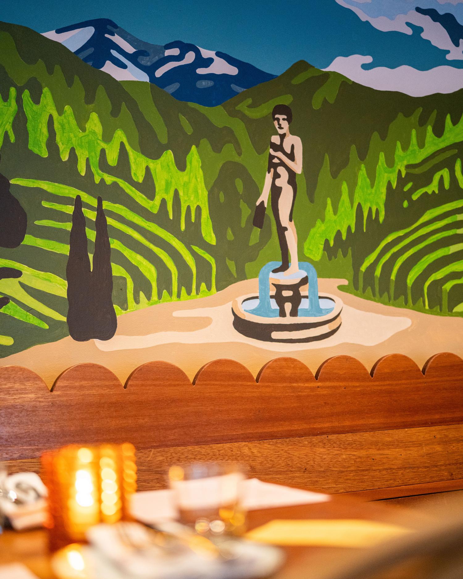
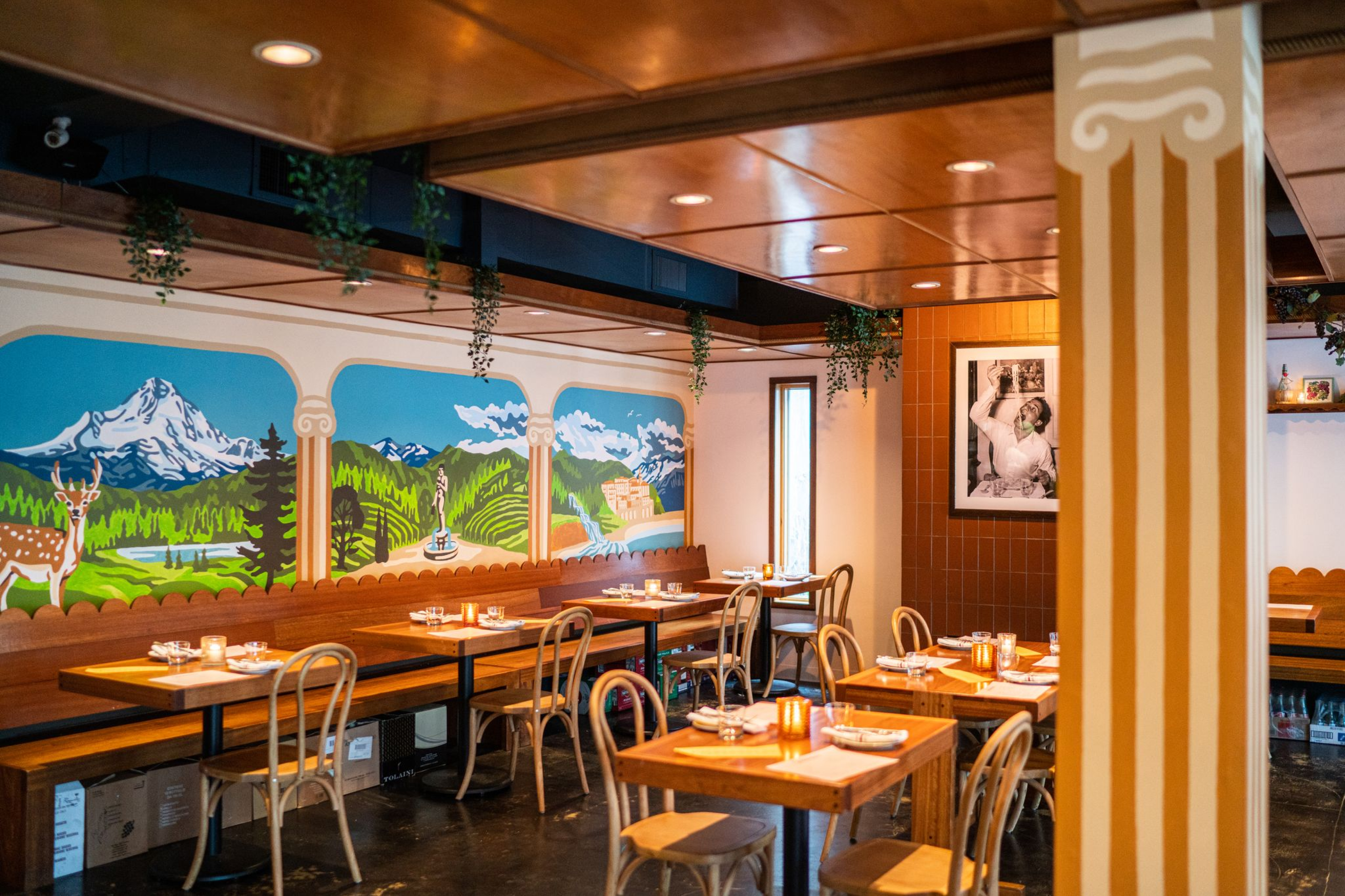
︎︎︎ Colby Brooks, mural
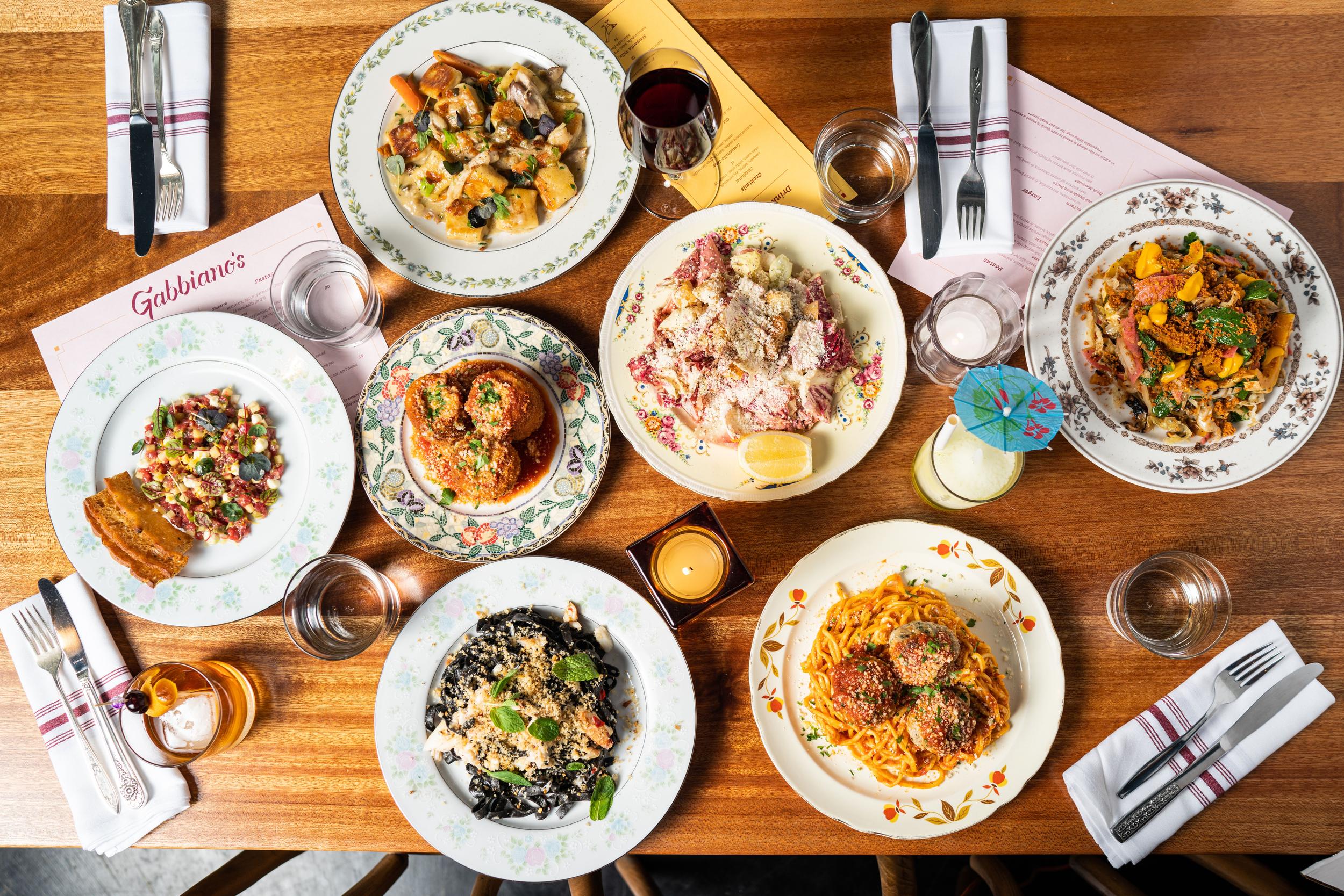
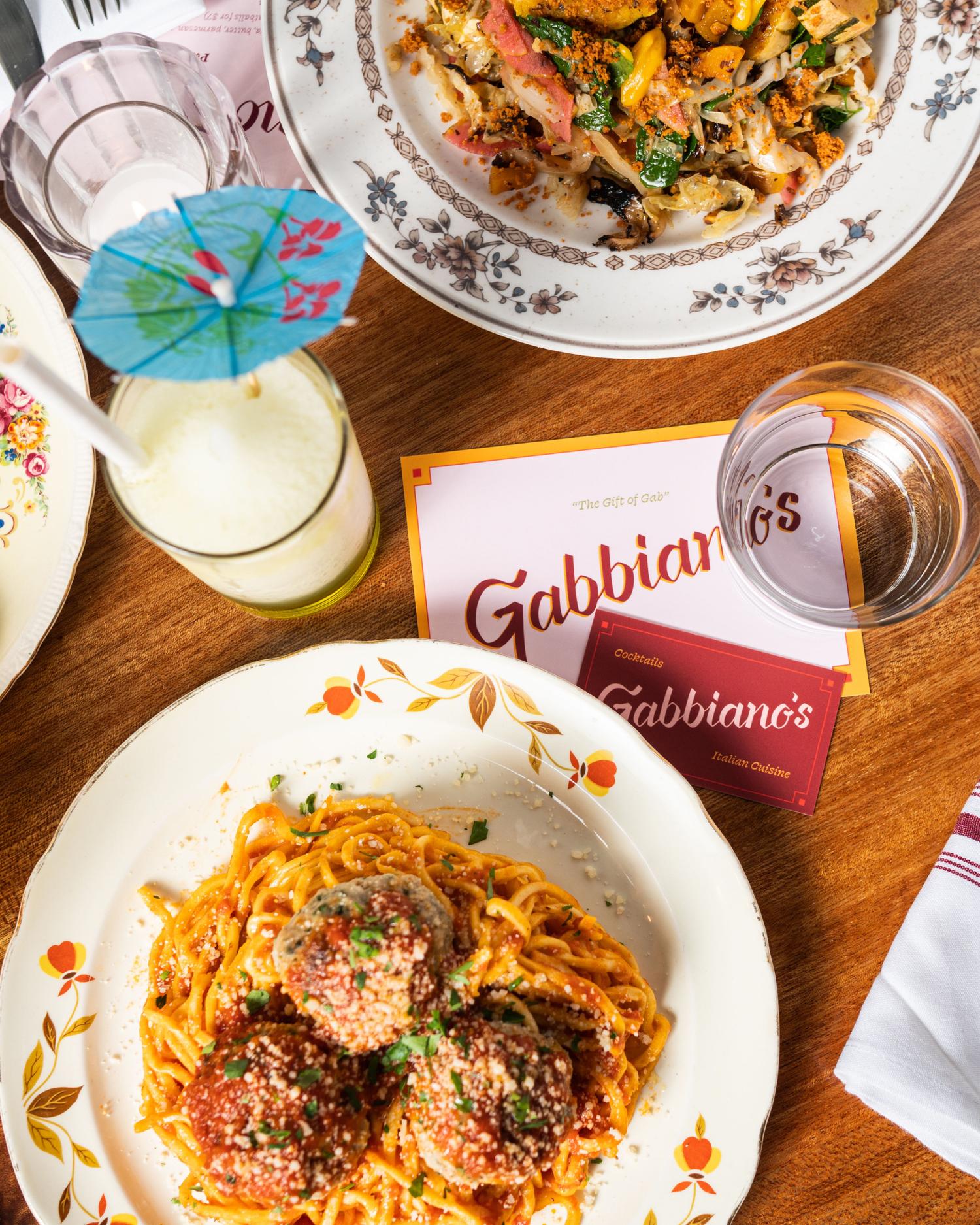
Gabbiano’s is inspired by nostalgic Italian-American restaurants of the the 1930s and 40s. It’s classic Italian-American fare, prepared with a modern-day sensibility. The team came to us with a strong vision and a space that had great bones—we collaborated to develop one of Portland’s most beloved restaurants.
Press:
︎ Oregonian’s 5th Best New Restaurant, 2023
︎ The 38 Essential Restaurants and Food Carts in Portland
︎ Portland Monthly Review
︎ Foodiesnitch “Dinner Spots in Portland,” viewed 427.5k times
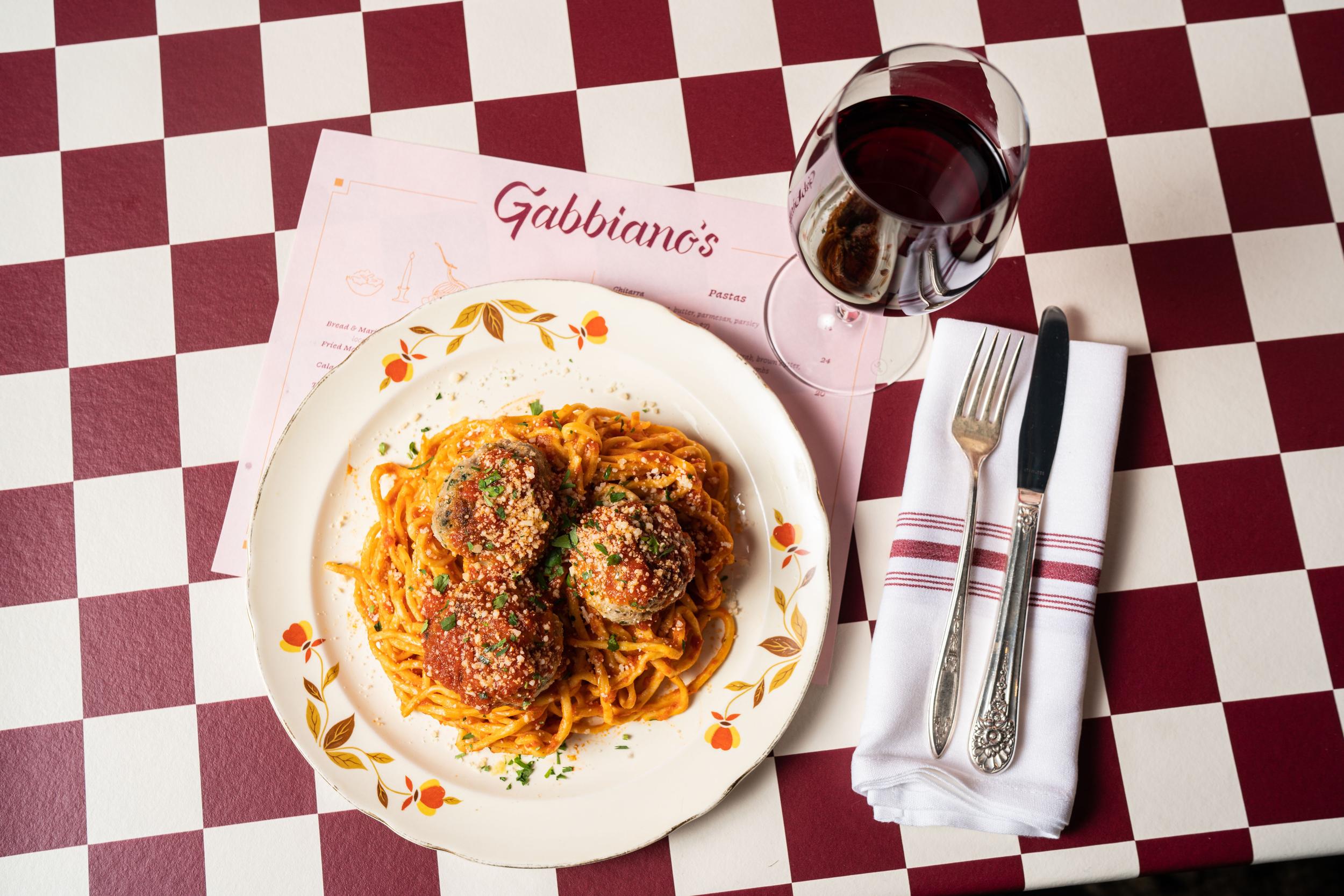
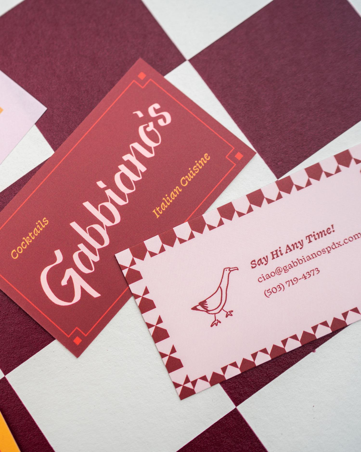
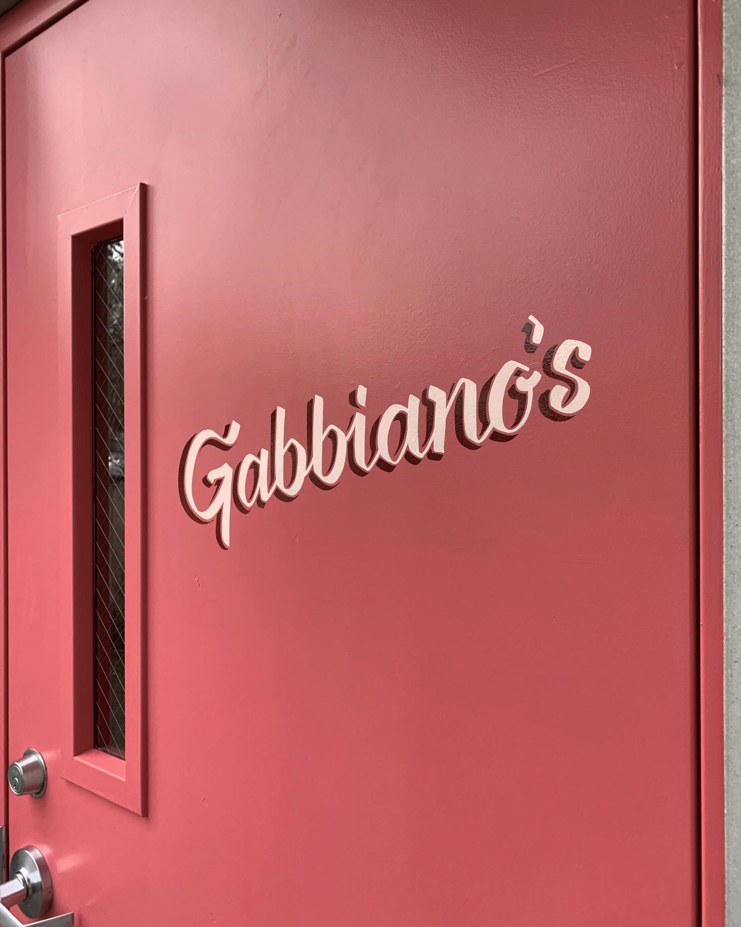
Concept & Visual Identity
The concept—“Red Sauce, Reimagined”— pulls from the classic restaurants of yore and the care-free joy that exists in those spaces. It’s the comfort of an old-school family restaurant, expressed through a contemporary lens, with a touch of loud rowdiness as a nod to their name, which translates to “seagull.” With this in mind, we developed a custom logotype that references vintage menus, and set it into a brand with a lively color and type story to bring it into current-day. Idiosyncratic illustrations add a boisterous vibe.
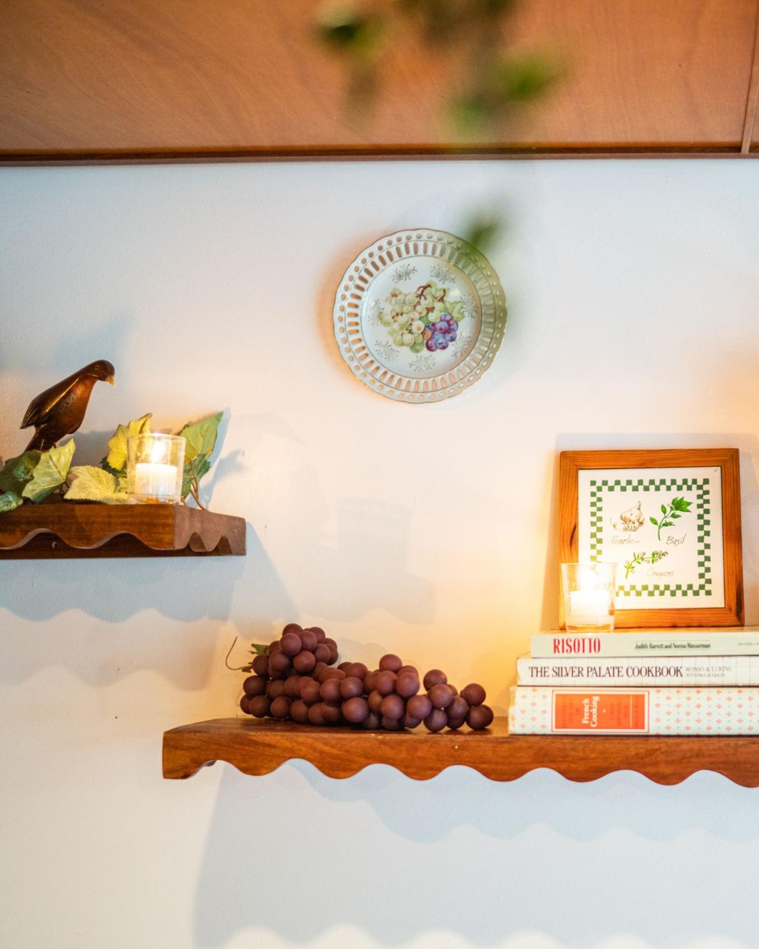
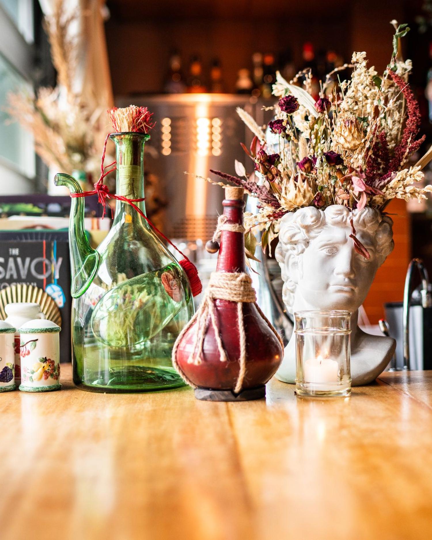
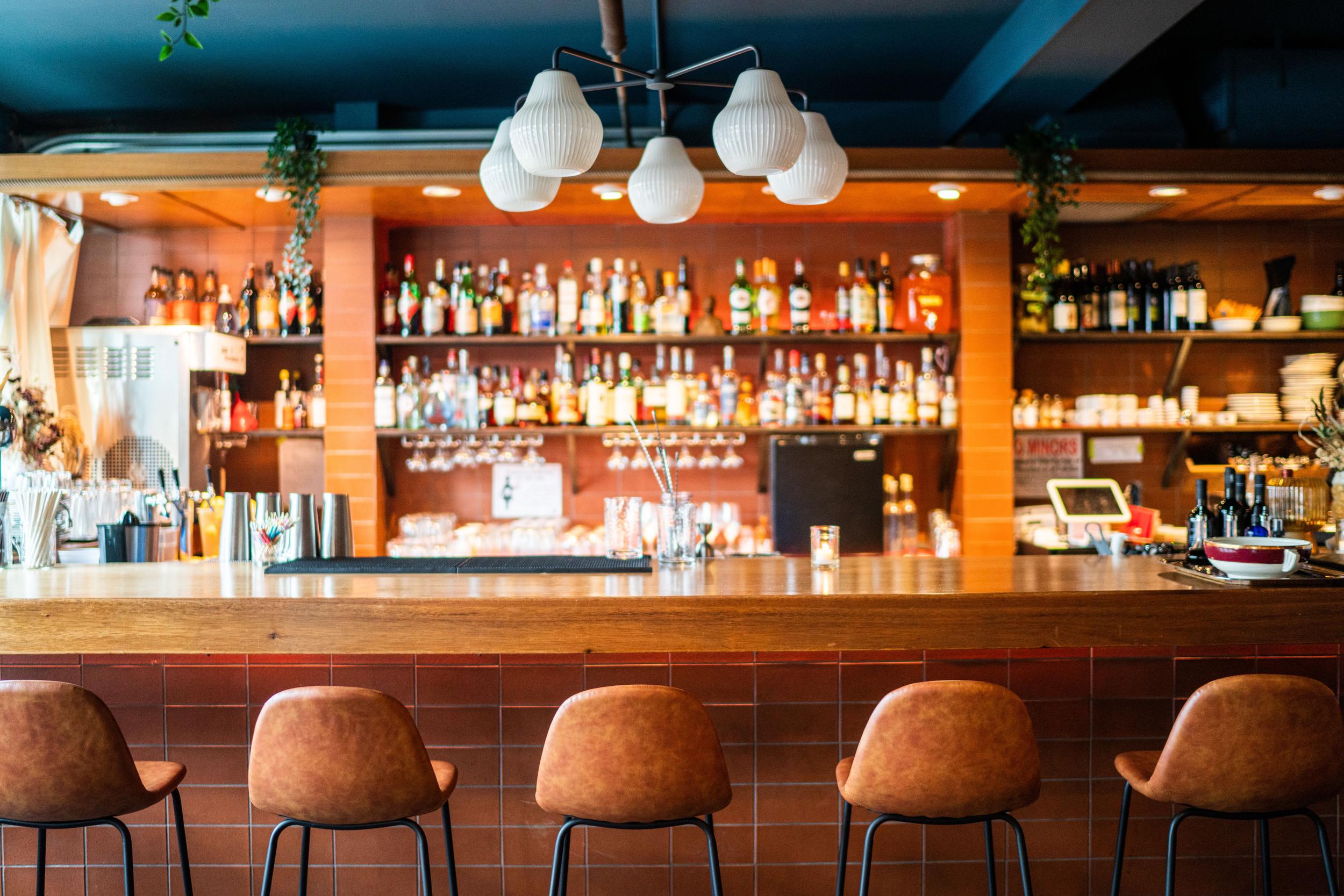
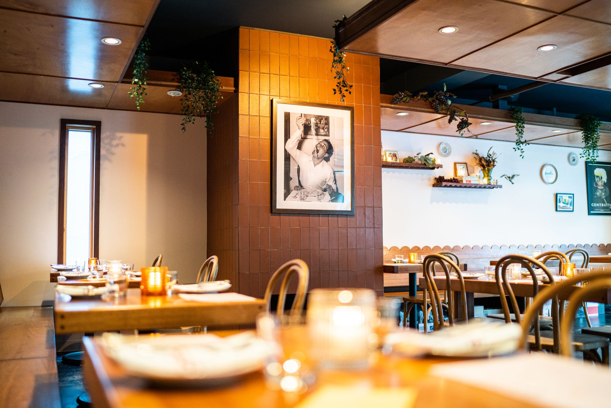
Interior Design
Our interiors strategy focused on adding warmth to the existing modernist framework. With scalloped edges on the banquettes, bent cane chairs, and intentional styling through decor, we transformed the space into the Italian-American restaurant of today. And of course, no Italian restaurant is complete without a landscape mural, so we hired and art directed illustrator Colby Brooks to bring this to life.