For Bitter For Worse
Completed:
2022
Roles:
︎ Brand Audit
︎ Brand Strategy
︎ Identity Design
︎ Packaging
︎ Marketing Materials
Collaborators:
︎︎︎ Emily Brown, illustration
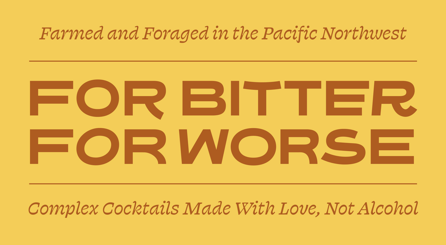
A new look for alcohol-free cocktails. FBFW is a woman-led N/A beverage company based in the Pacific Northwest. They approached our team with the need for updated packaging, which would begin with a brand refresh. Their current brand reflected the hand-crafted ethos of their product, but had pain points around legibility and brand retention. We sought to further invite customers into their captivating brand story.
Press:
The New York Times, Imbibe, Wirecutter, Punch, LA Times, Newsweek, Forbes, Bloomberg, GQ, The WSJ, Self
Stockists
200+ retailers including New Seasons, Boisson, Hi Lo liquor market, The New Bar, Suckerpunch

Strategy and Concept
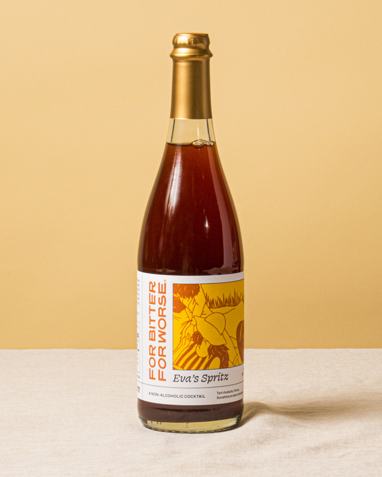
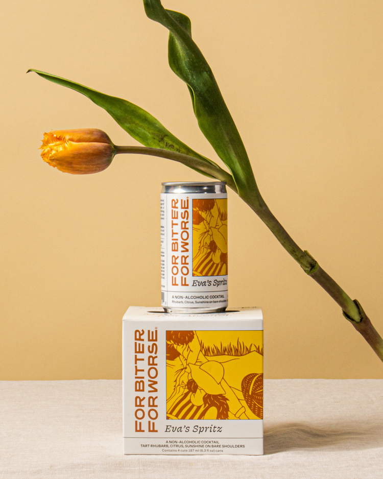
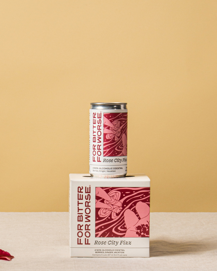
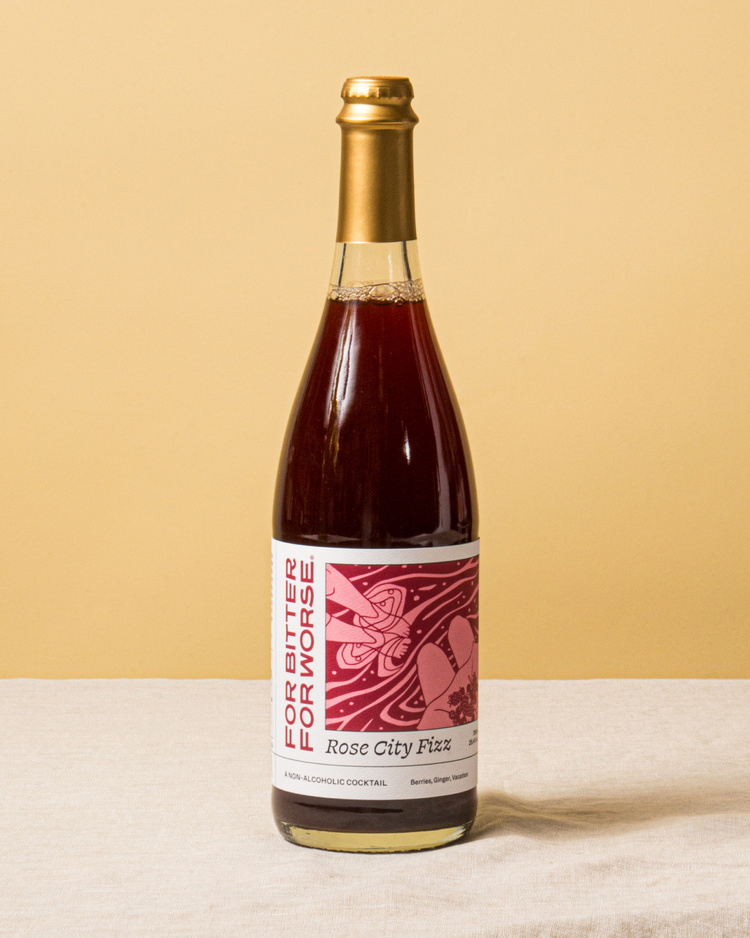
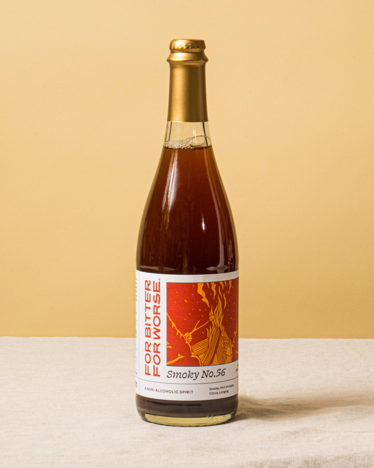
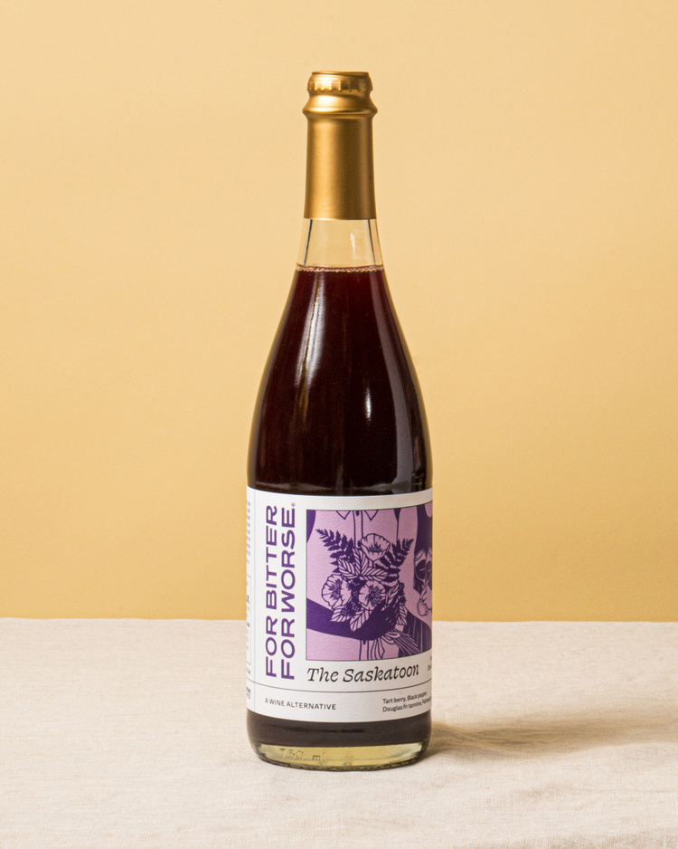
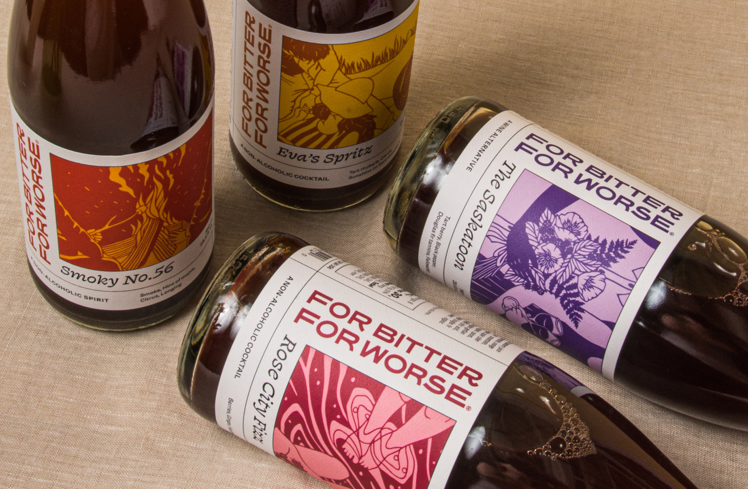
After auditing the brand, we recommended not only a packaging update, but also a brand refresh. FBFW strongly believes in the power of human connection, and that you don’t need alcohol to have a great time. We wanted to capture the spirit of FBFW while elevating the design to convey the quality of their product. We sought to update the logotype, color palette, and packaging to deliver a sophisticated and joyous brand.
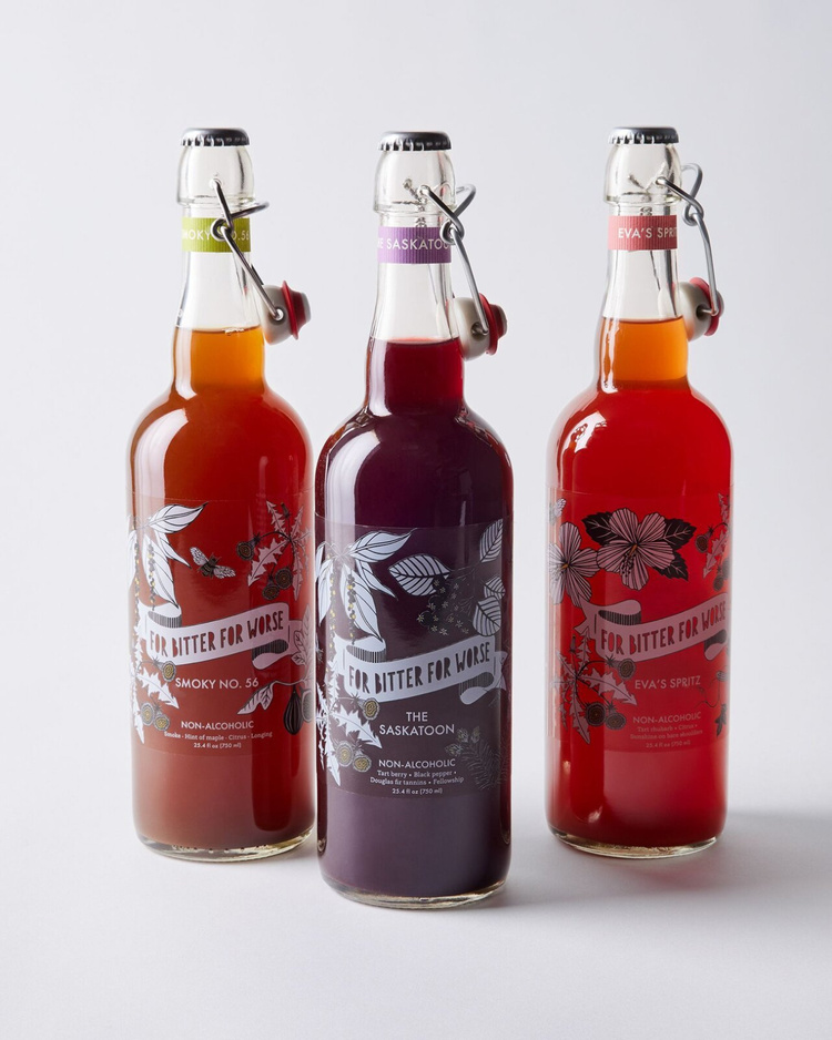
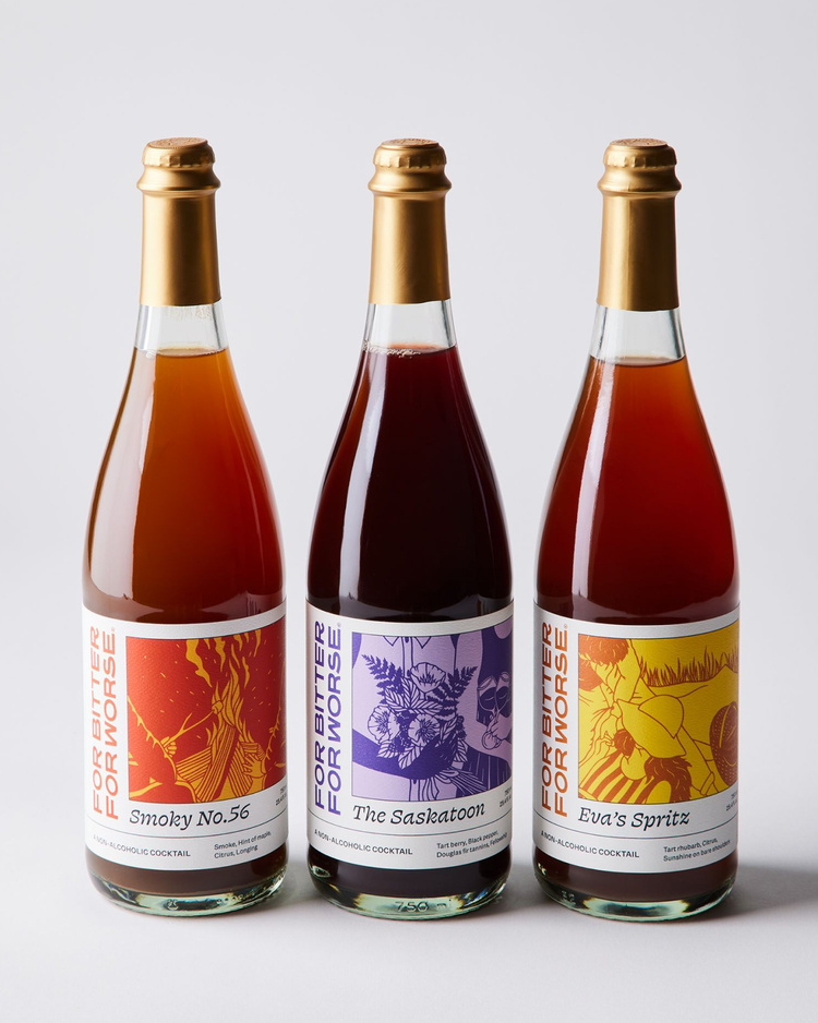
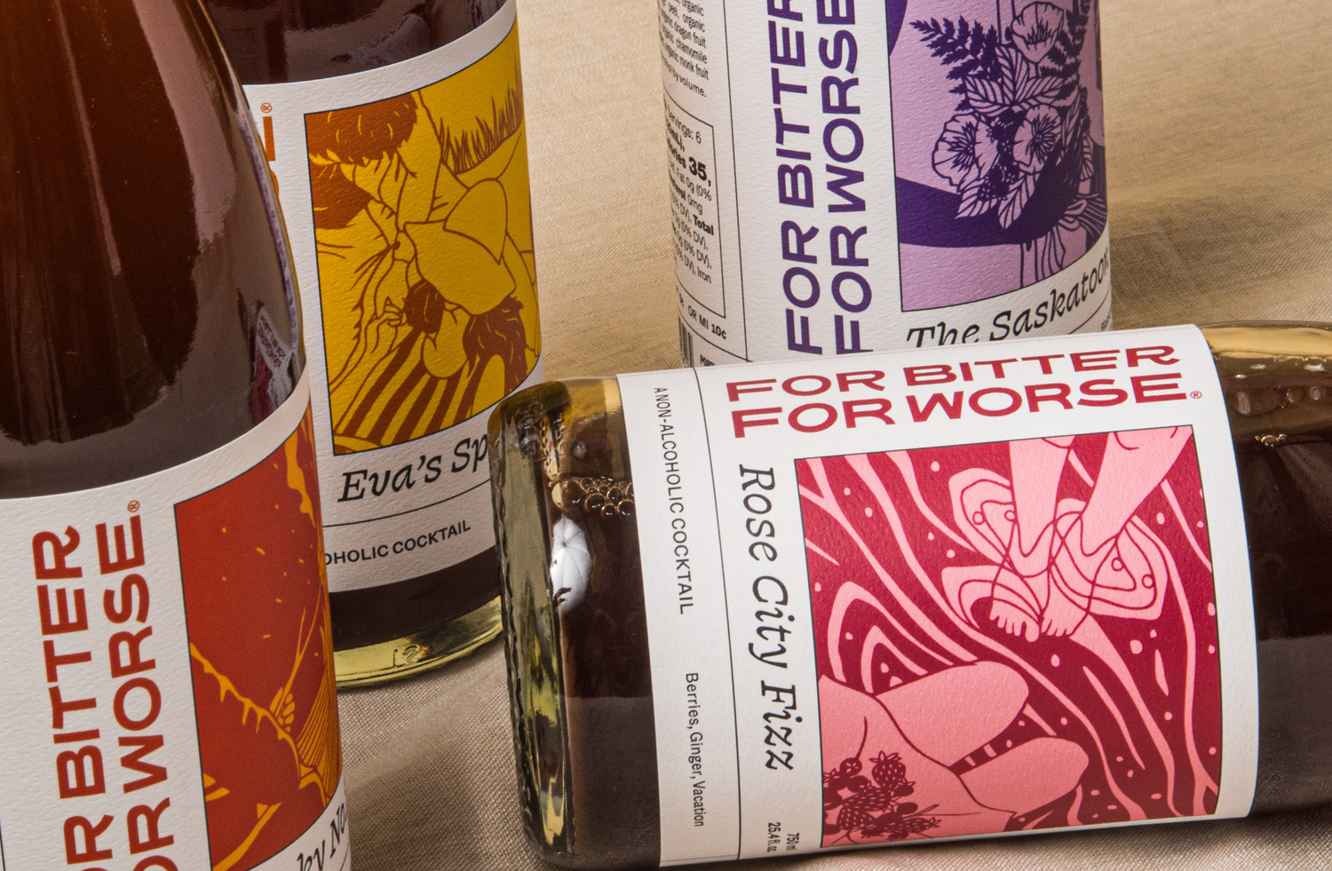
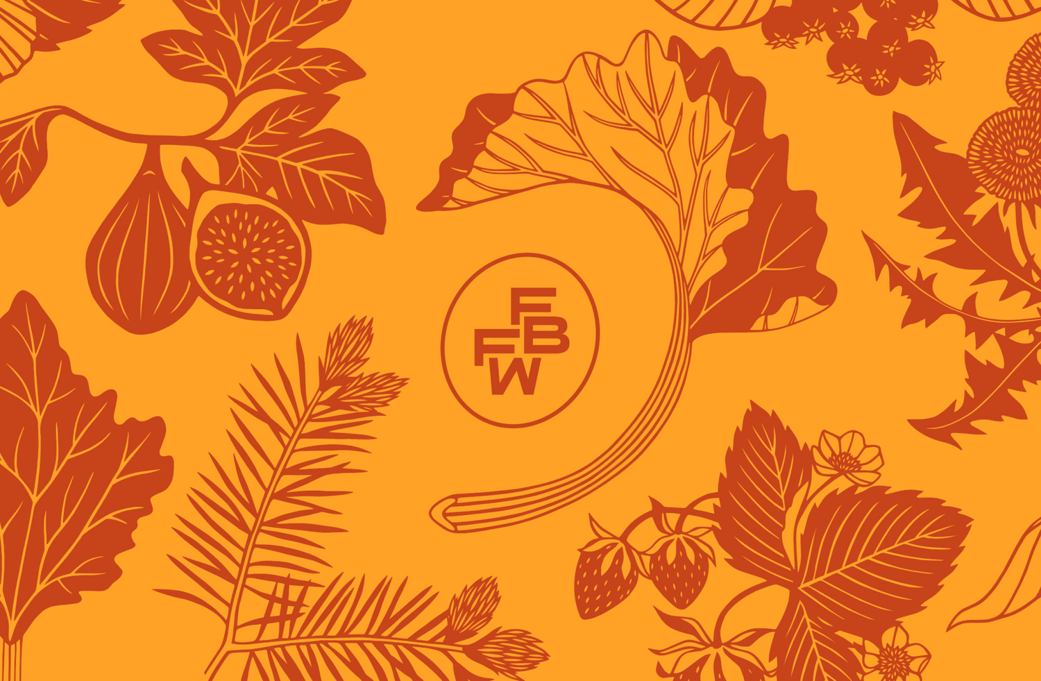
Design
The N/A market is saturated, so we developed a brand that catches your eye on the shelf. We refined the color and type systems to feel bolder and brighter, and paired this with illustrations that told a larger story of each cocktail. We worked with FBFW’s longtime illustrator, Emily Brown, to develop papercut illustrations that spoke to the human connection that their drinks might be a part of.